This project deals with data visualization.
For this purpose shape, color, arrangement and animation are the main elements.
This is achieved by programming the whole system using javascript.
the challenge
The information system had to be created just using shapes and colour.
There was no use of typography or numbers, symbols and piktograms allowed.
Further you couldn’t use buttons or similar to interact and navigate within the system.
So you had to use different shapes, sizes or colours to communicate the data of a chosen dataset.
the dataset
The dataset I chose consists of 671 songs from the last 70 years. The data was collected via the
Spotify API.
There you can access the meta data of the tracks, as well as the so-called
audio features.
These include parameters like dancebility, acousticness,
energy, valence, etc.
The data was then compiled into json format to use it within javascript:
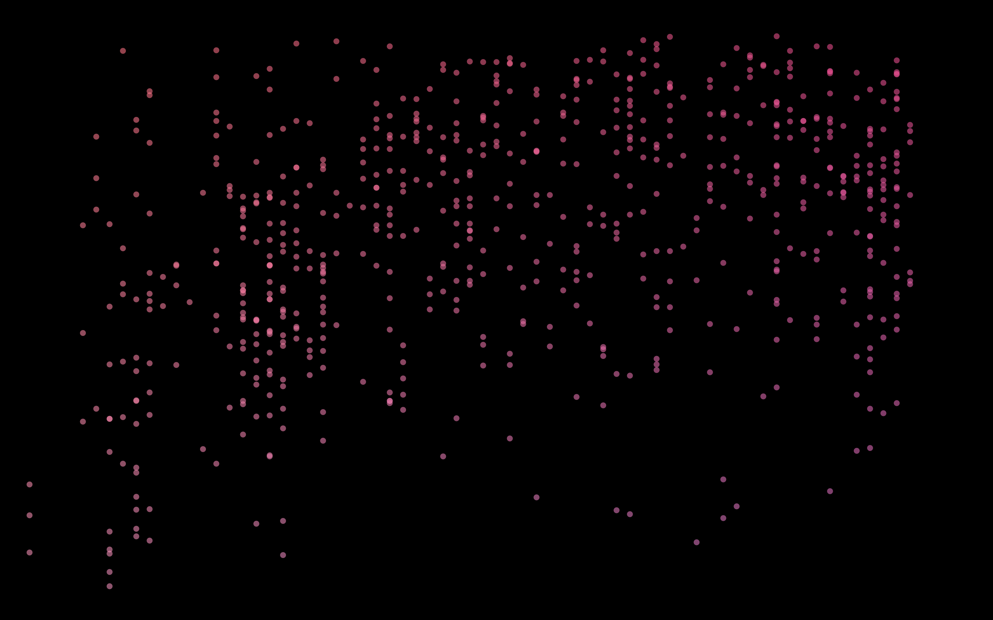
Each track is represented by one dot. The dots are drawn on the x- and y-axis depending on wich parameters are to be displayed.
In order to distinguish the different parameters and pages as much as possible,
I chose a different color for each parameter, e.g. red for energy, since red is a high-energy color, or a warm orange
for acousticness, since acoustic songs
usually sound warmer.
In addition, all colors have a gradient from desaturated to saturated depending on the strength of the parameter.
During the implementation the colors of both parameters which are displayed were mixed with each other to make the pages distinguishable by the colors.
releasedate
energy
danceability
acousticness
valence
liveness
how it works
In the first view you can see all songs sorted by releasedate next to each other as bars. The height of the bars indicates the average volume of the song.
The bars are animated to move up and down at the tempo of the song.
By clicking, the bars animate out of the screen and you'll get to the main view.
In the next view, the songs are displayed as dots. Here the X-axis represents
releasedate and the Y-axis energy.
By clicking on the tiles in the background, you can change which parameters are displayed on the axes (first x-axis, second y-axis):
view 1: releasedate & energy
view 2: releasedate & danceability
view 3: releasedate & acousticness
view 4: releasedate & valence
view 5: releasedate & liveness
view 6: popularity (opacity) & key (major, minor)
view 7: acousticness & danceability
view 8: valence & popularity
When hovering over a dot, in the first two views, the dots with similar tempo are highlighted and pulsing around tempo of the song. In the next two views, dots are highlighted if they have common genres.
In the other views, the dots with the same popularity are highlighted. Additionally the size of all dots changes according to popularity.
When changing to another view the dots don't get redrawn, but get animated to there new position, as to show the viewer how the parameters change and that those are always the same songs.


 view 1:
 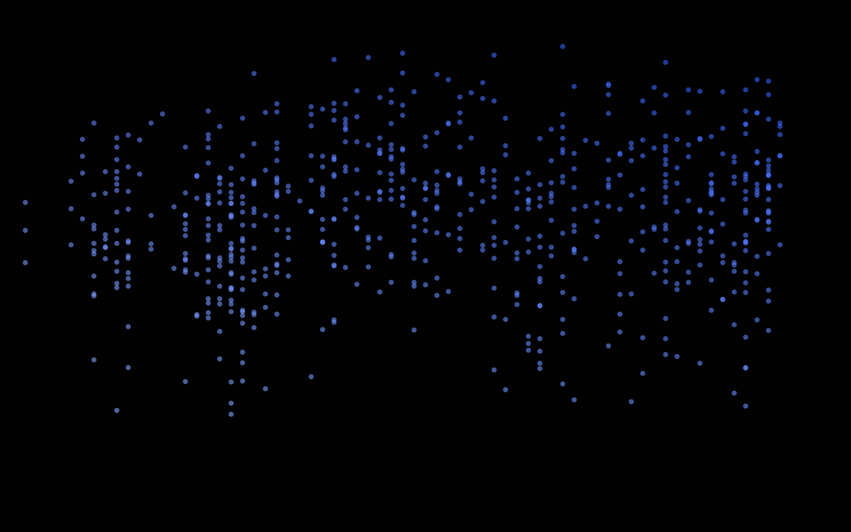 view 2:
 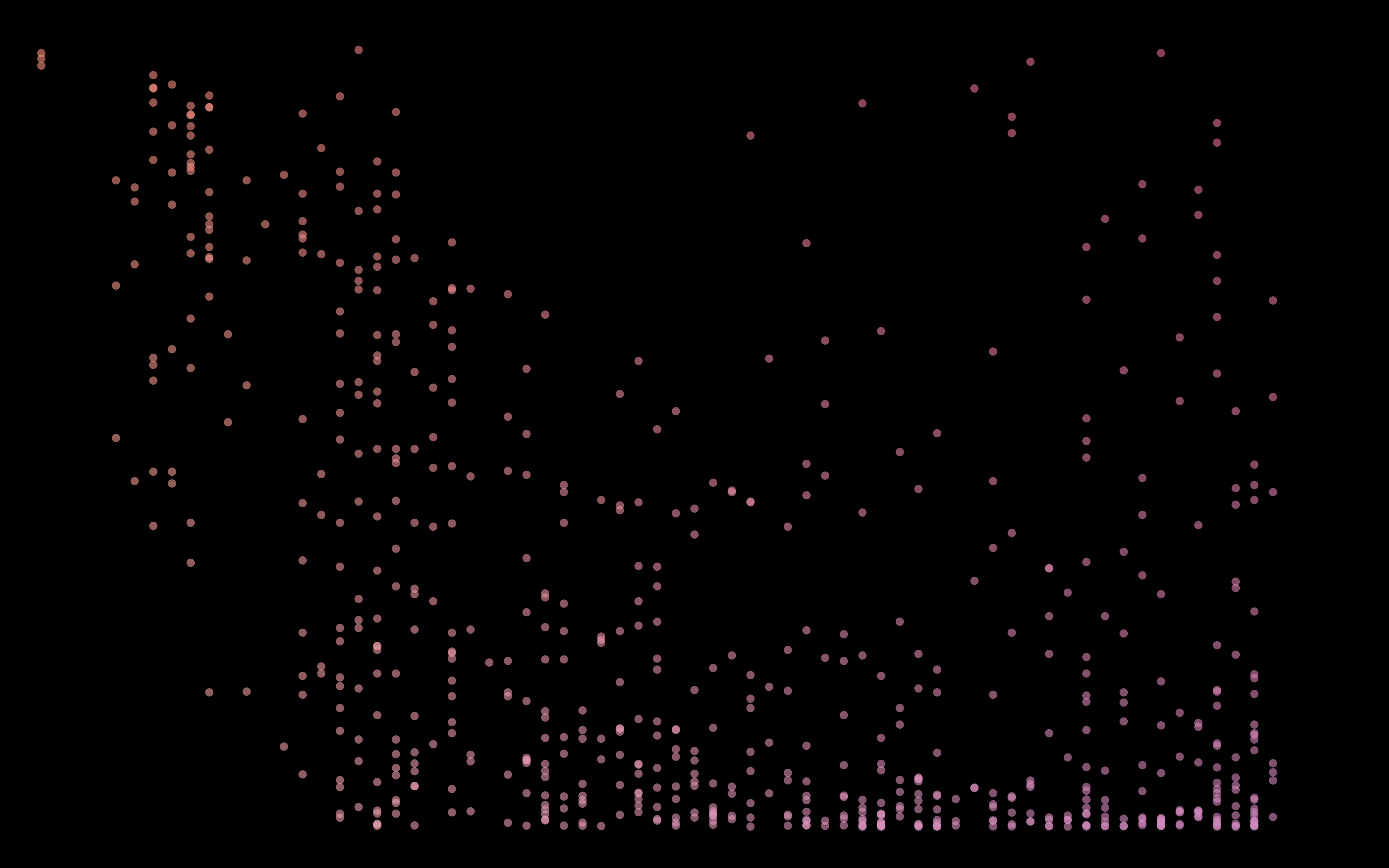 view 3:
 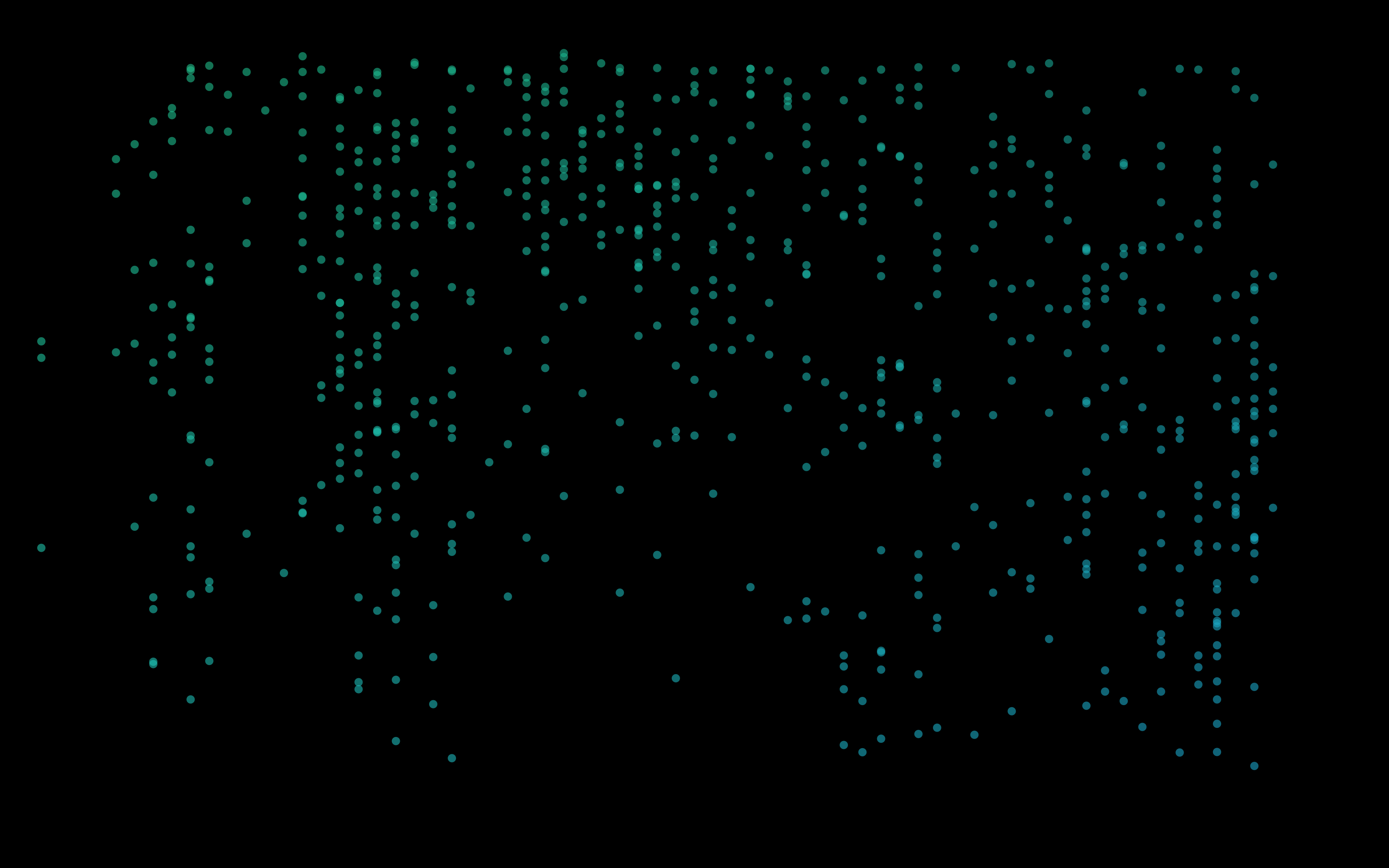 view 4:
 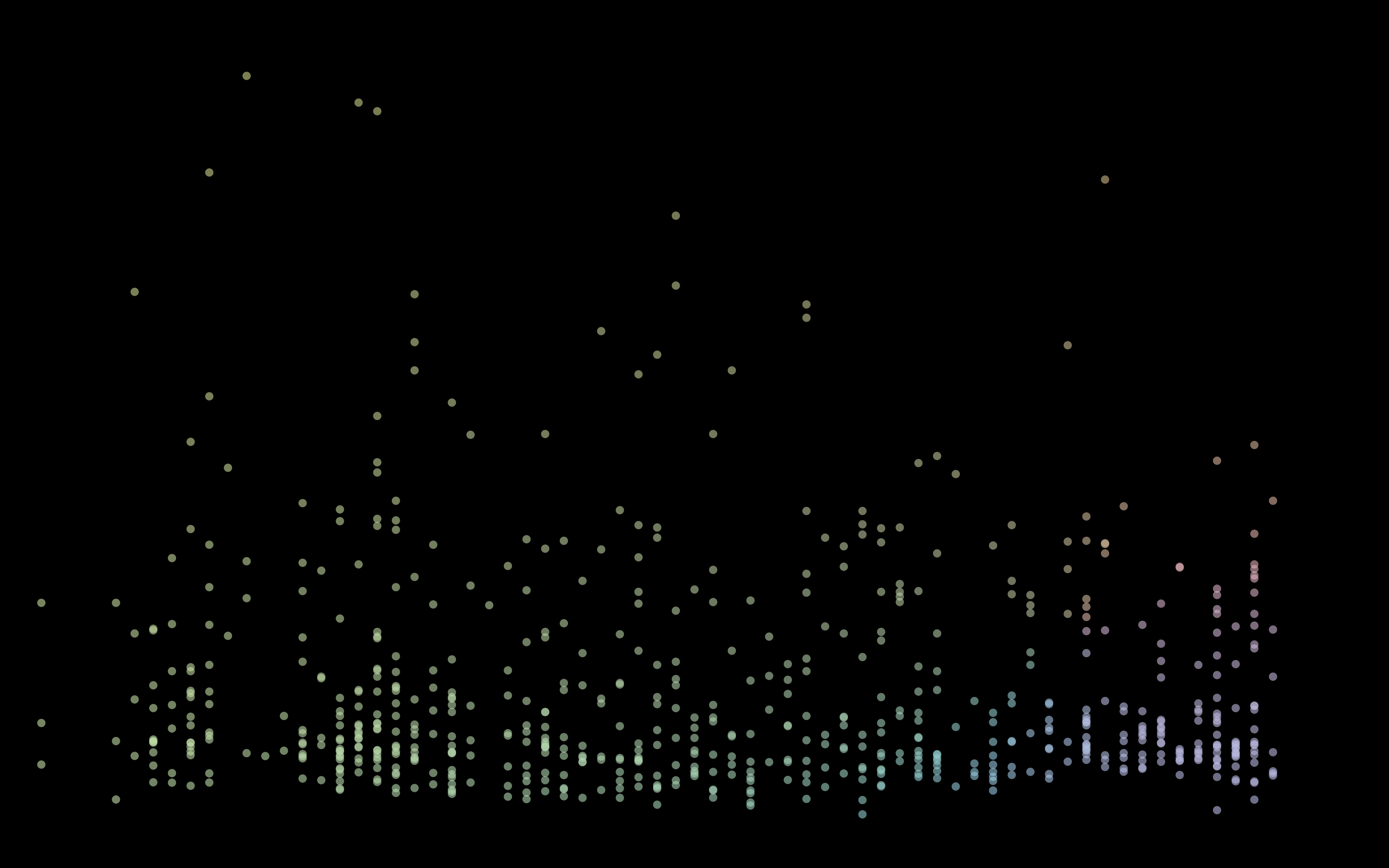 view 5:
 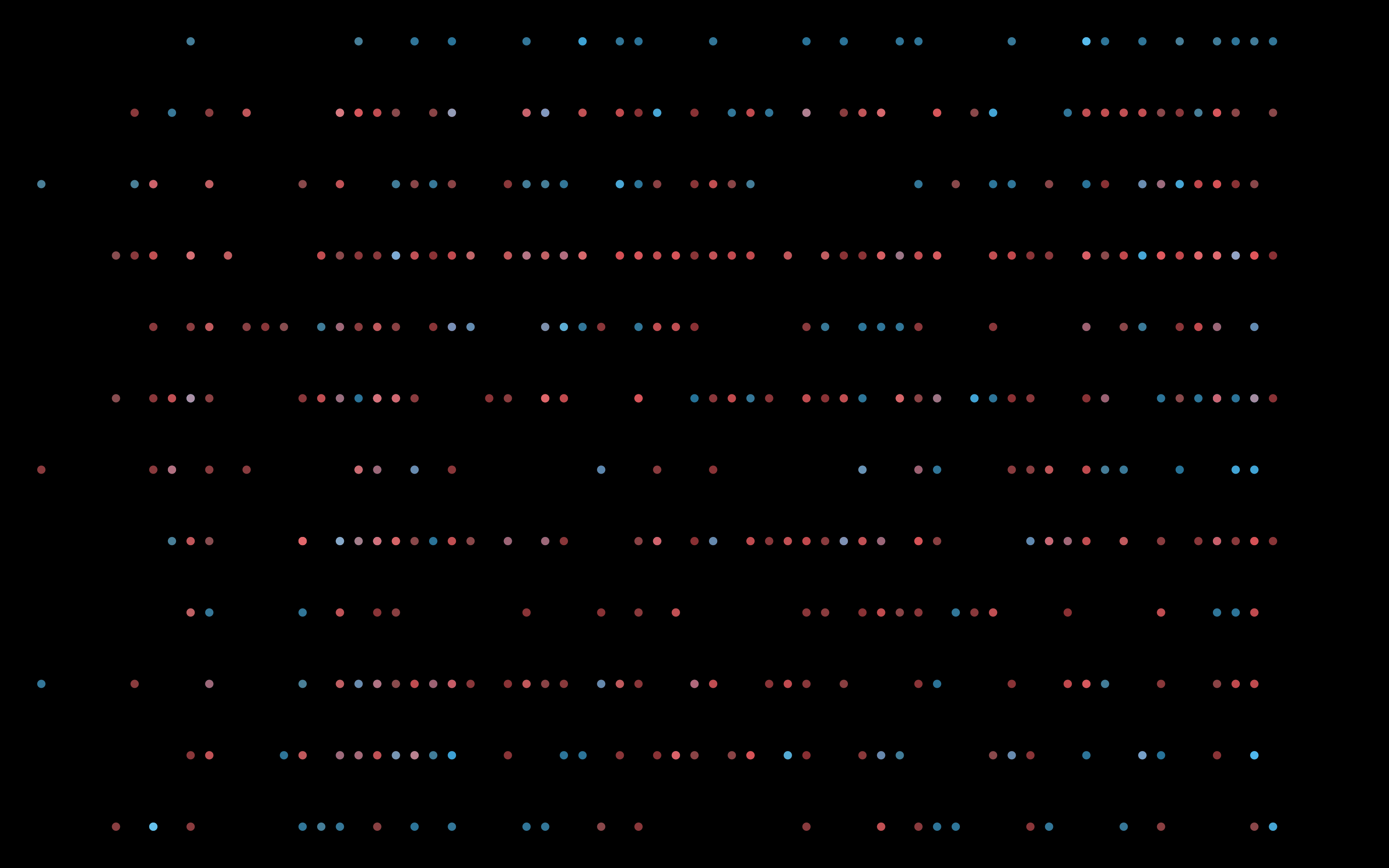 view 6:
 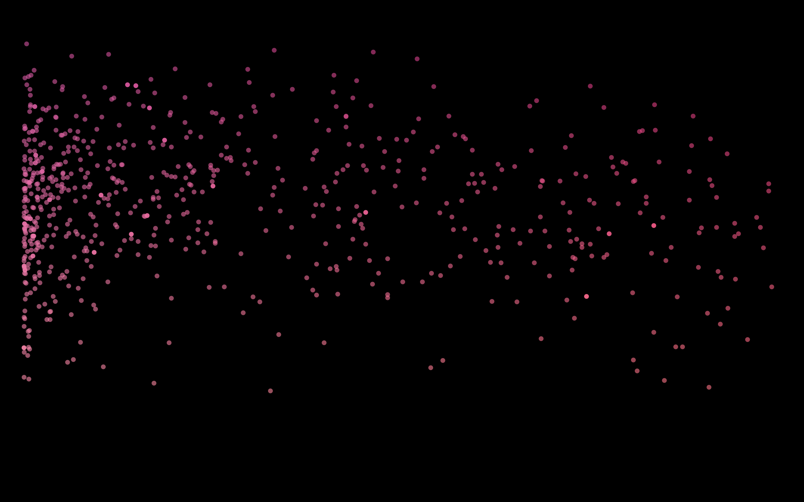 view 7:
 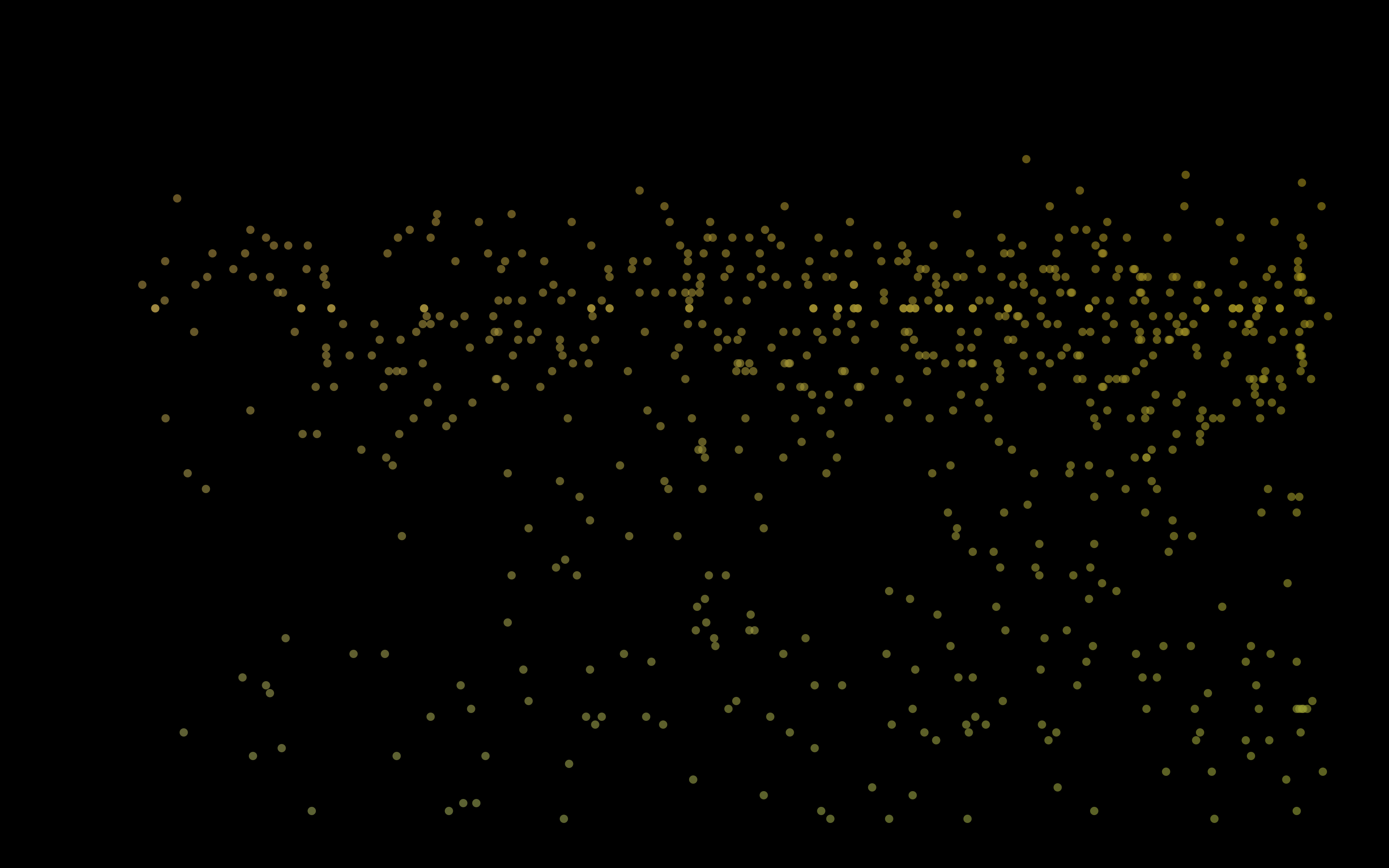 view 8: